
Introduction
The Shopify Revenue Dashboard is a real-time reporting tool within the Odicci platform that helps you track and analyse the financial performance of your promotional campaigns directly from your Shopify store data. Whether you are running a scratch card promotion, a tap-to-reveal campaign, or any other interactive gamification mechanic, the Shopify Revenue Dashboard provides the insights you need to measure campaign success and make informed business decisions.
This guide explains how to access the Shopify Revenue Dashboard, understand the key metrics it displays, and use the data to optimise your Shopify campaigns. You will need an active Shopify integration with Odicci and an active campaign to view revenue data.
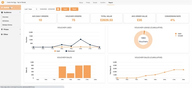
Accessing the Shopify Revenue Dashboard
To view your Shopify campaign's revenue data in the Shopify Revenue Dashboard, follow these steps:
- Log in to your Odicci account at app.odicci.com
- Navigate to your Shopify campaign – Find and select the specific Shopify campaign you wish to analyse from your campaigns list
- Click on the campaign name to open the campaign management interface
- Select the Report tab – Located in the top navigation menu alongside Setup, Prizes, Studio, and Confirm tabs
- View the Shopify Revenue Dashboard – The Shopify Revenue Dashboard will now display all available metrics and charts for your selected campaign, pulling data directly from your Shopify store
Direct URL Access: Each Shopify campaign has its own unique dashboard URL at https://app.odicci.com/report/voucher_dashboard/[CAMPAIGN_ID]/new. You can bookmark this for quick future access to your Shopify revenue data.
Understanding the Shopify Revenue Dashboard Layout
The Shopify Revenue Dashboard is organised in an intuitive layout with three main sections:
1. Date Range Selection (Top) At the top left, you will find controls to select the time period for your data:
- Preset options – Quick-select buttons for common ranges such as "Last 7 days"
- Custom date picker – Click the calendar icon to select start and end dates
- Apply button – Updates all dashboard metrics for your selected date range
- Reset button – Returns to the default date range view
2. Key Performance Indicators (Below date controls) Five large metric cards display your most important Shopify experience statistics at a glance, tracking real Shopify store data. These cards show:
- Average Daily Orders (from your Shopify store)
- Voucher Orders (Shopify customer interactions)
- Total Value (Shopify sales generated)
- Average Order Value (Shopify transaction value)
- Conversion Rate (Shopify purchase conversion)
3. Analytics Charts (Below KPI cards) Six interactive charts display detailed performance trends and patterns:
- Voucher Used (dual-line chart)
- Voucher Usage (cumulative pie chart)
- Voucher Sales (daily bar chart)
- Voucher Sales (cumulative line chart)
- Additional performance metrics and trends
All charts are interactive – hover over data points to see detailed values.
Shopify Revenue Dashboard Key Performance Indicators
The five KPI cards at the top of your Shopify Revenue Dashboard provide essential metrics for measuring Shopify campaign success. Here is what each metric means and why it matters:
Average Daily Orders
What it measures: The average number of orders (transactions) your campaign generates per day during the selected date range.
How it is calculated: Total number of orders ÷ number of days in the selected period.
Why it matters: This metric helps you understand the pace of customer engagement. A higher average indicates strong campaign momentum and customer interest. Use this to forecast total campaign reach and compare performance across different campaign types.
Example: An Average Daily Orders of 15 means your campaign is generating approximately 15 transactions per day on average.
Voucher Orders
What it measures: The total number of customers who have participated in your promotion and received a voucher (or promotional outcome) during the selected date range.
How it is calculated: Count of all voucher-generating interactions across the campaign.
Why it matters: This is your primary engagement metric. It represents how many customers have actually interacted with your gamification mechanic. Higher numbers mean stronger campaign reach and appeal. This is critical for measuring whether your promotional concept resonates with your audience.
Example: A campaign with 641 Voucher Orders means 641 customers successfully engaged with your promotion to receive their outcome.
Total Value
What it measures: The total monetary value in British pounds (£) of all Shopify orders placed during the selected date range as a result of your gamified campaign.
How it is calculated: Sum of transaction values from your Shopify store for every order during the period that participated in your Odicci campaign.
Why it matters: This is your headline business metric. Total Value represents the direct financial impact of your Shopify campaign on store revenue. This figure is essential for calculating return on investment (ROI) and demonstrating campaign value to Shopify store stakeholders. This data comes directly from your Shopify store's transactions.
Example: A Total Value of £21,115.81 means customers have spent a combined £21,115.81 across all Shopify transactions during your promotional period.
Average Order Value
What it measures: The average monetary value of each individual transaction during the selected date range.
How it is calculated: Total Value ÷ number of orders.
Why it matters: Average Order Value reveals the quality of each transaction. A higher AOV indicates your campaign is driving more valuable purchases. This metric helps you understand whether customers are making substantial purchases or minimal purchases just to participate in the gamification mechanic.
Example: An Average Order Value of £33 means customers are spending an average of £33 per transaction during your campaign.
Conversion Rate
What it measures: The percentage of customer interactions that result in a completed purchase.
How it is calculated: (Number of orders ÷ number of campaign interactions) × 100.
Why it matters: Conversion Rate indicates how effective your campaign is at moving engagement into actual sales. A higher conversion rate means your promotional mechanic is compelling and motivates people to make purchases. This is often the most important metric for measuring campaign effectiveness.
Example: A Conversion Rate of 4.50% means approximately 4–5 out of every 100 customer interactions result in a purchase.
Analysing Campaign Performance with Charts
Below the key metrics, the dashboard displays six interactive charts that provide deeper insights into customer behaviour and campaign performance patterns.
Voucher Used Chart
Chart type: Dual-line combination chart
What it shows:
- Orange line – Vouchers actually redeemed by customers for purchases
- Dark blue line – Total vouchers distributed to campaign participants
What it reveals:
- Redemption rate trends – How many distributed vouchers are actually being used
- Campaign engagement patterns – When customers are most active
- Customer behaviour – Whether redemption happens immediately or is delayed
- Inventory management – Whether you are distributing the right number of vouchers
How to interpret it: If the distributed line is much higher than the used line, customers are receiving vouchers but not immediately redeeming them, which may indicate delayed redemption patterns or potential barriers to the redemption process.
Voucher Usage (Cumulative) Chart
Chart type: Donut/pie chart
What it shows:
- Orange segment – Percentage of vouchers redeemed for purchases
- Light orange segment – Percentage of vouchers remaining unused
- Central number – Total active vouchers in your campaign
What it reveals:
- Overall redemption efficiency – What percentage of your voucher inventory is being used
- Campaign waste – How many vouchers remain unredeemed
- Offer appeal – Whether your incentive is compelling enough to drive redemption
- Promotion health – High redemption indicates an engaging campaign; low redemption may require offer review
How to interpret it: A small orange slice indicates low redemption. This may suggest you need to review your offer value, improve redemption messaging, or simplify the redemption process.
Voucher Sales Chart
Chart type: Vertical bar chart
What it shows: Daily monetary value (in pounds) generated from orders where a voucher was redeemed.
Visual breakdown:
- X-axis – Individual dates throughout your campaign
- Y-axis – Sales value in British pounds
- Each bar – One day's voucher-driven sales
What it reveals:
- Daily revenue impact – How much revenue your vouchers generate each day
- Peak performance days – Which days see the highest sales from voucher redemption
- Campaign momentum – Whether sales are increasing, stable, or declining
- Performance patterns – Typical sales variations across weekdays and weekends
How to interpret it: Large bars on certain days show when voucher redemptions peak. This information is valuable for understanding customer shopping patterns and planning future campaigns.
Voucher Sales (Cumulative) Chart
Chart type: Line chart
What it shows: A running total of all cumulative sales generated from voucher redemptions from campaign start through each subsequent day.
Visual breakdown:
-
X-axis – Individual dates throughout your campaign
-
Y-axis – Cumulative sales value in British pounds
-
The line – Upward trend showing total sales accumulation over time
What it reveals:
-
Total campaign revenue – Combined total of all sales from voucher usage
-
Revenue velocity – How quickly your campaign is generating sales (steep line = fast growth; flat line = slow growth)
-
Progress toward targets – Whether you are on track to meet total campaign revenue goals
-
Long-term campaign health – Whether performance is sustained or declining over time
How to interpret it: A steeply climbing line early on that then flattens indicates strong initial performance with declining momentum. A consistently steep line shows sustained, strong revenue generation throughout your campaign.
Monitoring Your Shopify Campaign in Real-Time
When Shopify Data Updates
The Shopify Revenue Dashboard provides near real-time data pulled from your Shopify store, with updates typically occurring every 5–15 minutes as new Shopify customer orders are processed and synced to Odicci.
Important: There may be a brief delay (usually less than 15 minutes) between when a customer completes a Shopify transaction and when it appears in your Shopify Revenue Dashboard. During periods of exceptionally high Shopify traffic, updates may take up to 30 minutes to reflect in the dashboard.
Best Practices for Monitoring
- Check daily – Review your dashboard at least once per day during active campaigns to spot trends early
- Set performance targets – Before launching, establish goals for Total Value, Average Order Value, and Conversion Rate
- Monitor redemption rates – Track the Voucher Used chart to understand customer redemption behaviour
- Identify peak days – Use sales charts to determine which days perform best for future campaign planning
- Share results – Use dashboard screenshots and data to communicate campaign performance to stakeholders
Accessing Historical Data
You can view any historical data from your campaign by adjusting the date range selector:
- Past data – All historical data from your campaign is retained indefinitely
- Custom ranges – Select any start and end date within your campaign's active period
- Archived campaigns – Reports for completed campaigns remain accessible for historical reference and ROI analysis
Comparing Shopify Experience Performance
To compare performance across multiple Shopify campaigns, you can:
- Open experiences in separate browser tabs – Access each Shopify campaign's Report tab in different tabs for side-by-side comparison of Shopify revenue data
- Document key metrics – Take screenshots of KPI cards to compare Shopify sales performance across campaigns
- Review similar date ranges – Ensure you are comparing equivalent time periods across Shopify campaigns for accurate analysis
- Use historical data – Apply the same date range to different Shopify campaigns using the date selector
This approach helps you identify which Shopify experience types, offers, and mechanics drive the best results for your store.
Quick Reference: Key Metrics at a Glance
| Metric | Measures | Target | Interpretation |
|---|---|---|---|
| Avg Daily Orders | Orders per day | Higher is better | Indicates campaign pace and momentum |
| Voucher Orders | Total engagements | Higher is better | Shows how many customers interacted with your promotion |
| Total Value | Revenue generated (£) | Higher is better | Primary measure of financial campaign impact |
| Avg Order Value | Average spend (£) | Higher is better | Reveals transaction quality and average customer spend |
| Conversion Rate | % of interactions that convert | 2–5% typical | Shows effectiveness at moving engagement to purchases |
Troubleshooting Common Issues
Shopify Revenue Dashboard not loading?
- Ensure you are logged in to your Odicci account with proper Shopify integration
- Verify the Shopify campaign is in active or completed status
- Try refreshing your browser page
- Clear your browser cache if the page appears outdated
- Confirm your Shopify store is properly connected to Odicci
Shopify data not appearing or updating?
- Wait 10–15 minutes for Shopify data to sync and refresh in the Shopify Revenue Dashboard
- Verify that Shopify transactions have actually occurred during your selected date range
- Confirm the date range selector includes the dates you want to view
- Check that the Shopify campaign is active and accepting orders in your store
- Verify your Shopify integration is active and properly configured
Metrics showing zero or unexpected values?
- Ensure your Shopify campaign has been live long enough to generate Shopify transactions
- Verify customers are actually interacting with your campaign in your Shopify store
- Check that the date range includes the period when Shopify transactions occurred
- Confirm your Shopify store is receiving orders during this period
- Contact Odicci support if you suspect a Shopify data syncing issue
Questions or need support?
- Contact the Odicci support team at customersuccess@odicci.com with details about your Shopify store
- Your customer success manager can provide detailed analysis and guidance on optimising your Shopify campaigns
- Visit www.odicci.com for additional resources and Shopify integration information
Next Steps
Once you are familiar with the Shopify Revenue Dashboard:
- Review your active Odicci experiences – Check the Report tab regularly during your Shopify campaigns to monitor store performance
- Set benchmarks – Document Shopify performance metrics to use as comparison points for future campaigns
- Optimise based on Shopify data – Use insights from the Shopify Revenue Dashboard to improve your experience, offers, messaging, or mechanics for better store results
- Plan future experiences – Use historical Shopify data to inform strategy for upcoming promotions
- Share Shopify results – Communicate campaign impact to stakeholders using Shopify Revenue Dashboard data
For more information about running gamified campaigns with Odicci for your Shopify store, visit www.odicci.com or speak with your customer success manager.